The Fifty-Millisecond Trial: How Six Psychological Triggers Decide Whether a Website Earns the Click
May 11, 2026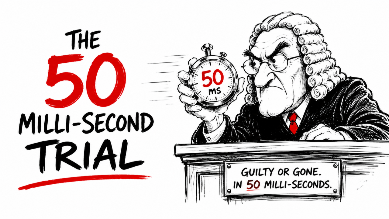
The Fifty-Millisecond Trial
How Six Psychological Triggers Decide Whether a Website Earns the Click
The verdict arrives in fifty milliseconds. Less time than a blink.
By then, a visitor has already decided whether the page in front of them looks credible — whether the product feels premium or sketchy, whether the offer reads as legitimate or as a hustle. The headline hasn't been processed. The benefits haven't been weighed. The reader has not yet, in any meaningful sense, started reading. And the case is closed.
What follows on the page — the scrolling, the skimming, the click or the close — is largely the visitor confirming or revising a judgment they didn't know they were making.
That fifty-millisecond window is the architecture on which the modern web has been built. According to a recent analysis by content marketer Casandra Campbell, who maps six cognitive triggers shaping every conversion online, the entire conversion economy rests on a handful of predictable shortcuts in the human brain. They have been studied. They have been tuned. And for the people building landing pages right now, they are the whole game.
The Verdict Arrives Before the Reader Does
The bias driving that fifty-millisecond judgment has a name. Psychologists call it the halo effect — the tendency of an overall impression to contaminate every specific judgment that follows. Campbell distills it to a single sentence: "If something looks good, we assume it is good."
The practical consequence is that the first trigger: visual design has quietly been promoted from decoration to evidence. A clean, minimalist layout reads as a premium product. A cluttered, outdated page reads as amateur — or worse, fraudulent. The product behind both can be identical. The visitor will never know it. And the visitor will never care.
For consumers, the implication is uncomfortable. Trust is being awarded or withheld on grounds that no one is consciously evaluating. For marketers, the implication runs the other direction, and it runs harder. A polished above-the-fold layout, a single strong image, a benefit-driven headline — these are not aesthetic choices. They are trust signals firing below the threshold of conscious thought, doing the work of persuasion before the persuasion even starts.
Which raises an obvious question. If the design earns the first impression, what wins the second one?
When Cleverness Costs the Click
The second trigger works against most marketers' instincts.
It is called cognitive fluency — the brain's preference for information that is easy to process. When something feels simple to read, the mind treats that simplicity as a signal that the content must be true, safe, or worth engaging with. Friction reads as deception. Ease reads as honesty.
Campbell points to research showing that an identical statement is rated as more credible when set in clear, high-contrast type than when it appears in low-contrast or difficult fonts. The substance does not change. Only the friction does. And the friction is enough to shift whether the reader believes what is in front of them.
The implication for copy is direct. Clever phrasing forces the reader to stop and decode. Stopping is where conversions die. Confusion creates friction. Friction creates drop-offs. Drop-offs end the visit.
The test Campbell offers is brutal in its simplicity: hand the page to someone with no context, ask them to explain it back in five seconds, and watch what happens. If they can't, the page isn't clever. It's broken.
But clarity alone doesn't close the gap. There is a third trigger — and it is the oldest one in marketing.
The Crowd Decides First
The principle is older than the internet, and it was formalized for the marketing profession by psychologist Robert Cialdini in his landmark book Influence. It is social proof, rooted in the bandwagon effect: humans look to other humans for cues about what to believe and how to behave, especially when uncertainty is high.
Online, that translates into a familiar visual vocabulary. Testimonials with photos and names. Logos of recognizable brands. Subscriber counts. Media mentions. Real-time activity notifications announcing that someone in another city just signed up. Each signal is small. Each signal works in the same direction. Each one tells the visitor that reasonable people have already made the leap, and the visitor would not be the first.
But the mechanism has a tripwire.
Social proof works only when it feels authentic. Generic testimonials, suspiciously round subscriber counts, and logos plastered without context can flip the signal in the opposite direction. Today's consumers, Campbell argues, can detect manufactured proof in seconds — and once they spot it, the rest of the page goes with it.
For marketers, the most useful detail is geography on the page. Social proof placed adjacent to the call to action delivers a confidence boost at the exact moment hesitation peaks. The visitor looks for a reason not to click. The proof is the answer.
Hesitation, though, doesn't only come from doubt. It also comes from time. Which brings the fourth trigger to the front.
The Math of Missing Out
There is a finding in behavioral economics that explains nearly every countdown timer on the web. The pain of losing something is roughly twice as psychologically powerful as the pleasure of gaining something of equal value.
That asymmetry has a marketing name. Fear of missing out. FOMO. And it is the engine behind a now-standard visual grammar: enrollment windows closing at midnight, cohorts with three seats remaining, bonus stacks for buyers who act before a deadline, inventory counters ticking down in real time.
Scarcity makes the offer feel more valuable. Urgency compresses the decision window. Together, they can override the hesitation that would otherwise lead a visitor to close the tab and come back later — a path that, in practice, almost always means never coming back at all.
But the same lever, misused, dissolves the trust the rest of the page has worked to build. A countdown timer that resets on every page reload is not urgency. It is a tell. And it suggests that everything else on the page might also be theater.
Campbell's test for legitimate scarcity is specificity. Real deadlines. Real numbers. Real reasons. "Enroll by Sunday to get 30 percent off, next opening is six weeks away" works because the visitor can see exactly what they would lose. "Limited-time offer" does not work, because the visitor cannot see anything at all.
Even when urgency lands honestly, though, the visitor still has to find the button.
Following the Gaze
The fifth trigger lives in small visual decisions most visitors never consciously register.
Humans are visual decision-makers whose brains constantly scan for cues telling them where to look next. Research cited in Campbell's analysis shows that people automatically follow the gaze of others. Meaning that an image of a person looking toward a call-to-action button can measurably lift the conversion rate of that button. The visitor does not know why their eye has moved. The eye has simply moved.
High-performing landing pages engineer these cues with intent. Arrows and directional lines guide the eye toward the click. Photos of human faces orient attention. Contrasting button colors make the next step unmistakable. White space isolates the call to action so the visitor doesn't have to search for it.
Then there is the button itself "The Sixth Trigger".
First-person calls to action — phrasing along the lines of "Yes, I want this" — tend to outperform passive verbs like "Submit" or "Buy now." Lines that explicitly lower perceived risk — "No credit card required," "Instant download," "Try free for 14 days" — reduce the commitment threshold. Each tweak rests on a single principle: commitment feels easier when risk feels smaller.
For visitors, the design choices fade into the background. For marketers, they are the most testable elements on the page — and the highest-leverage place to spend an afternoon.
Still, even the right cue pointing at the right button can fail if one element is missing. The visitor has to believe what happens after the click is safe.
The Quiet Architecture of Trust
The sixth principle is the one that holds the other five together. People do not convert when they are uncertain. And uncertainty is rarely about the product itself.
It is about risk.
What happens after the click? Will the charge hit immediately? Will the inbox be flooded for the next two years? Is the refund policy real, or is it a paragraph buried in a terms-of-service page? Campbell references behavioral economics research showing that users engage more readily with ecommerce platforms that feel culturally and contextually legitimate — a finding that explains the visible scaffolding of trust on every high-converting page.
Money-back guarantees. Recognized payment logos. Transparent pricing. Clear privacy language. Photos of real humans behind the company. Trust marks from third-party reviewers. None of it requires flashy design. All of it requires visibility. The point is to answer the visitor's unspoken questions before the visitor consciously asks them.
One of the most underused tools in the modern conversion toolkit, Campbell observes, is the simple objection-handling block — a section that names the visitor's doubts directly and dissolves them in plain text. Do I need to enter a credit card? Can I cancel? Each answer is a friction killer. Each one is a small act of preemptive honesty.
And preemptive honesty turns out to be the through-line of the entire framework.
What the Findings Mean for Anyone Building — or Visiting — the Modern Web
Together, the six principles describe an infrastructure most users move through every day without noticing. The polish of a header. The contrast of a font. The placement of a testimonial. The wording of a button. The visibility of a guarantee. Each one is a cognitive lever that has been studied, measured, and tuned.
For the marketers applying the framework, the takeaway is simpler than the marketing industry usually pretends. Conversion is not a design problem. It is an alignment problem between a page and the predictable shortcuts the human brain takes when it meets new information. "You don't need to be a design genius to build a high-converting landing page," Campbell writes. "You only need to understand how people think."
For everyone else — the visitors, the buyers, the readers — the same findings describe the environment in which their attention is being engineered every time they open a tab.
That cuts both ways. The same fifty-millisecond verdict that protects people from obvious scams can be earned dishonestly by sophisticated operators who have learned the rules. The same scarcity signal that makes a real cohort feel valuable can be faked by an operator with nothing to sell. The same trust badge that anchors a legitimate transaction can be lifted and pasted onto a page selling nothing at all.
The dividing line between persuasion and manipulation, in the end, runs through one variable. Whether the claims being made are actually true.
The psychology is neutral.
The choices made with it are not.
